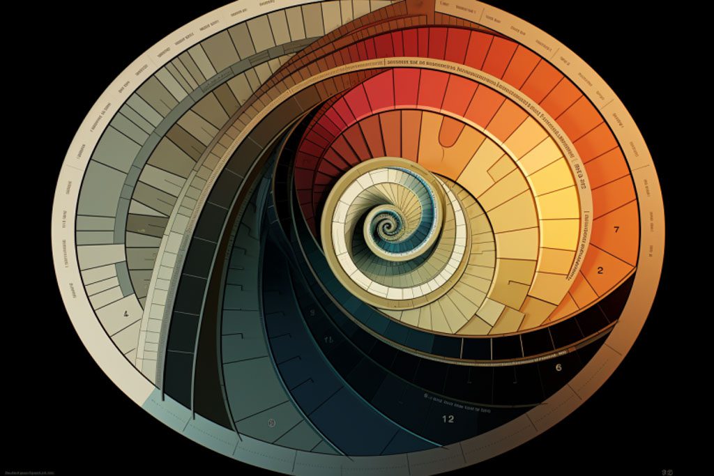


The foundations began with Isaac Newton’s color wheel in 1666 displaying the visible spectrum. Chemist Michel-Eugène Chevreul revealed adjacent hues boost vibrancy. Impressionists explored color relationships in light, while Seurat mathematically blended pigments for optical vibrancy. s. Soon neo-impressionists like Seurat were meticulously applying optical color theory to provoke visual effects
This science powerfully impacts interior design. The color wheel unveils harmonious combinations – complements enliven, warm/cool tones create cohesion, monochromatics soothe, and accent colors draw attention. Beyond combinations, individual hues carry cultural symbolism and elicit responses. Red energizes, blue calms, green rejuvenates. Soft tints romanticize, bold jewel tones dramatize. Dark rooms feel cozy, light ones airy. Psychology explains how color unconsciously influences furniture choices and mood.
Historically harmonious schemes provide inspiration. Art Deco’s rich jewel tones, French Country’s airy pastels, Victorian’s nature-inspired palettes. Replicate hues from a beloved heirloom or artwork. Limit main colors to three with small accents. Maintain 60% dominance of a primary hue. Photograph inspiration combinations to visualize cohesion.
Color trends trace cultural shifts. The earthy 1970s responded to environmentalism. The neon 1980s reflected technological revolution. The neutrals of the 1990s aligned with pared-down grunge. Today’s preferences for bold, ethnic palettes mirror globalism.
While color theory may seem complicated, having confidence in choosing color combinations is possible for everyone with some core knowledge.
The color wheel is the starting point – it demonstrates how complements contrast dramatically, while adjacent tones complement. Warm hues energize and cool ones calm. Simply choose one dominant color you love, then integrate complements as 10-30% accents. Limit to 3 main colors for cohesion.
Pro tip that many designers follow to strike a beautiful balance is limiting accent colors to 10-30% of the overall scheme. Choose one dominant hue you love for 60-80% of the space – this will be the primary visual foundation. Then integrate secondary hues for 30-40% of items, like some furniture or decor. Finally, use a pop of an accent shade like pillows or artwork for 10-30%. Varying the accent percentages creates interest within the ratio guidelines. This technique allows accents to stand out and contrast against more neutral main hues without becoming overwhelming or imbalanced. With one color taking center stage and carefully chosen accents in supporting roles, a cohesive and appealing color palette emerges.
With some theory and risk-taking, curating captivating color schemes is achievable. Reference eras that resonate. Replicate heirloom hues. Visualize through photos. And unleash your inner Matisse! Color composition takes practice, but a harmonious home filled with personalized palettes awaits.

Built & Designed by Fastweb2